As a part of my research on educational games, I deal with a lot of in-game data trying to figure out what players are doing. This is really helpful for iterative design because the collected data can point out things like where players quit, how long players play, and what parts of a game are interesting. This information is super helpful when you’re tweaking levels, or making changes to gameplay.
A type of analysis I like to use as a first pass visualization is a heatmap. There’s a great article about heatmaps over on Gamasutra that does a good job of showing how this analysis can guide game design. The featured image (above) is a heatmap visualization of data gathered from the game Fair Play. The bright red spots show areas where players gathered most and the blue spots indicate less activity. I have a paper coming out soon about some of my findings from running this type of analysis on Fair Play, and I’ll make sure to upload it once it’s available.
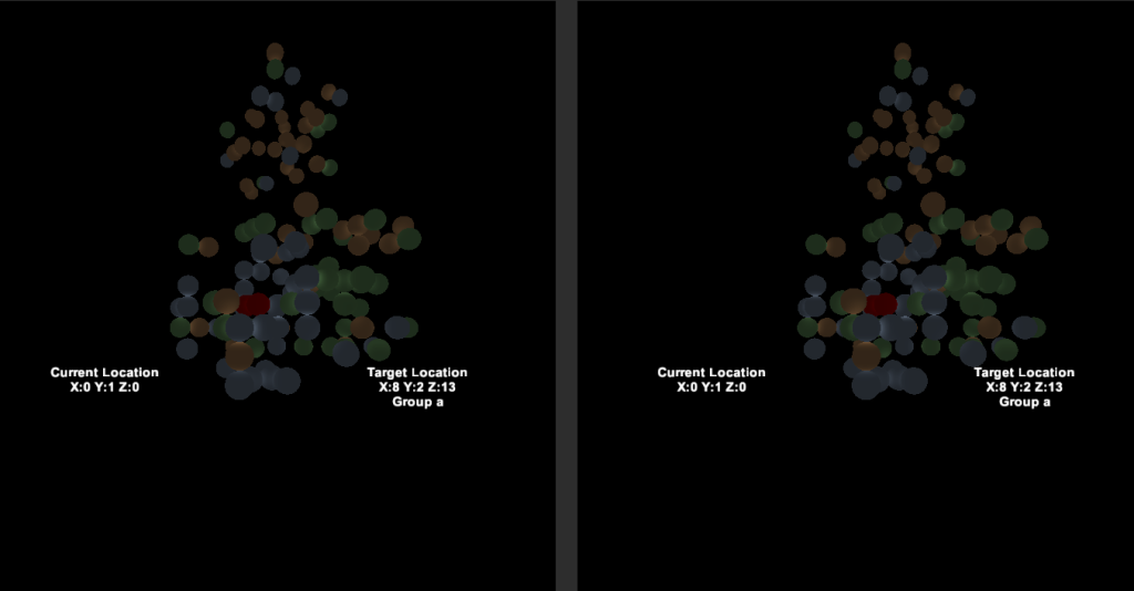
Sometimes 2d heatmaps don’t tell the whole story. If the game itself isn’t 2d, some information like height might be discarded. Once I became familiar with the google cardboard API I created a 3d version of the heatmap so that I could view the data for several angles at once. The demo worked well and I was happy to see the particles appear on the level. Compared to the usual 2d rendering, this version felt much more intuitive. Plus, it made the level look like a magic snow globe which was really cool. The response has been positive so far, and I might make the demo available for download if people are interested.
Once I showed the demo to my friends over at the Complex Play Lab we started to brainstorm other data sets we might be able ti visualize in a similar way. Matthew whipped up a data set with 3 clusters, and I started to code something that would generate these dots in a virtual reality headset. This resulted in the following visualization:
Like the Fair Play demo, this app allowed us to view the data from several angles in real-time which gave a better sense of how close the clusters were to one another. This was really exciting because a couple of years ago (while I was working with the Epistemic Games Group) we had trouble visualizing multi-dimensional data using 2d visualizations. By adding another dimension we got a much better feel of the data, at least for a first pass.
I like to think this counts as part of my game a week, cause it’s cool, but, let’s be real, it isn’t. I’ll get back to that soon!

