From July 2009

Muse Learning Theory / Design

Sensory education
Intrinsic link of senses and mind. Children must experience
concepts, not just learn them. (Montessori)

Young children learn through physical interaction. They test their physical boundaries because it’s new to them by playing, running, jumping, screaming, dancing, climbing, etc. Play is the heart of Waldorf kindergarten (Steiner)

From the interview with music teacher/observation…

How Children Learn Pitch/ How Teachers Teach Pitch

Young children learned pitches not only through listening but also seeing the guidance and gestures from the teachers.  The music instructor we interviewed also mentioned the following teaching methodology using gestures and visualization to teach pitch.

1. Body gesture

If the child is singing lower than the correct pitch, teacher will lifting the hand up to tell the child to sing higher until the child sings the matched pitch.  If the child is singing higher than the correct pitch, teacher will lower the hand down to let the child know that he should be singing lower. When the child sings the matched pitch, the teacher will inform the child that he gets the correct one.

2. Rubberstamp game

In classroom, teacher gives each children a piece of paper and a pencil. Children will draw a line to divide a piece of paper in half, the horizontal line is the base line.
Then each children is given a rubberstamp.  The teacher tells children if they hear a note or a pitch that either higher or lower in relation to the sound of base-pitch she played before, stamp the rubber stamp on to the higher area or lower area.  It can be very high from the base line, very low form the base line, very close to the base line, and from left to right.

Then, teacher can also ask children to hum or sing the notes (rubberstamp marks) on the paper. This way, children learn the basic concept of staves and sight reading.

Ability to Produce Pitch

Children learn with many senses even in the music field where people think hearing and ability are all that is needed to be successful. Young children also do not have enough ability (motor skills/voices) to “produce” a correct pitch, even they might be able to distinguish different notes/pitches. A teacher needs to introduce them how to play instruments such as Piano, Violin, Flute, etc. before children can produce the sound.  However, some musical instruments such as violin and flute do not have the visual mapping as obvious and direct as keyboard instrument. So some children might not be able to produce a sound even they can distinguish the difference.

Productive Play

Play is a productive means of allowing children to explore, inquire and have their senses educated. (Montessori)

Play with a purpose

Learning by play has a purpose, an intent, and an end in mind. “…play has an end in the sense of a directing idea which gives point to the successive acts. Persons who play are not just doing something (pure physical movement); they are trying to do or effect something, an attitude that involves anticipatory forecasts which stimulate their present responses.” (Dewey)

Play as a pedagogy
Play serves as a functional instructional strategy in which learning takes place within the meaningful context of a game. In playing games, participants in the learning environment go through a series of cognitive disequilibrium and accomodation, resulting in learning.

Physical Interaction and Collaborative Learning/Playing

To introduce the fundamental of music, children are given the lessons in group such as rhythmic class or dance class.  The tools that teachers use are varied, other than the examples above.
According to Waldorf education, finished toys limited children imagination and force children to play in a certain way, predictable and limited.

With the interaction design of MuSe, we believe that we will provide users with more affordances than learning pitch through instruments or through existing tool such as pitch-bells.

Muse has flexibility to let teachers and learners explore the pitches learning through different modes of play and use many kinds of physical interaction with the toy.

Children can use any parts of their body to produce sound through the buttons.  They can stand, step on, jump, sit, hit, and put each buttons either on provided-podiums or onto environments (chair, sofa, table, floor).  In order to expand and invite more players to play and produce music together.

MuSe enables the user to trigger a certain pitch by pressing the corresponding pitch pad. A computer recognition system is integrated to play the tone and show the corrected note for the users.

With this toy, kids can practice pitch listening through various games, either with the computer (e.g. dance on the pads to play a song, listen to a piece of music and repeat the last pitch he/her hears, etc.) or with group of friends (e.g. play a song together, the first who repeats the last pitch right win, etc.).

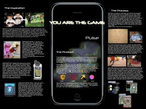
Pulse Story Board

For my story board I chose to represent the task of a player playing king of the hill offensively. There are 3 ways our group discussed in which a player can play offensively. One is of course to score. In order to score players must get to the hill and stay there as long a s possible. The more time on the hill the more points you get. The next way to play offensively is to use virtual weapons. There are 2 types of virtual weapons, bombs and mines. Bombs can be used immediately and affect the surrounding players. Mines can be set at a given location and later detonated from a distance. In all cases players must move to a predefined area whether it be to get on the hill, or to pick up a weapon. These areas are found by searching for their icon in the in game map. Weapons are used/detonated by pressing the weapon’s image on the screen.

User Test

  1. Testing the current game – Our plan is to test the game interface indoors without the physical element. Users will be asked to create a Pulse game, define the settings of the game, and play. They will not be told by the testers what the objective of the game is, or how to play it. We believe that a good game interface would help the player learn the rules and objectives, even if they are not experienced. There is a help screen in the application that the users can pop up, which explains the objective of the game and icons. Ultimately, the user test would include testing the interaction between the physical and digital aspects of the game. However, the current stage of the game requires us to test the layout of the game setup and the ability of icons and symbols to communicate. So, we informed users that the icons would eventually be controlled by GPS signal, however that in the test they should point the icons toward their destinations.
    Questions we want to answer:
    How does a first-time user understand the game rules and mechanics?
    How intuitive is it to create the game with Pulse?
    Is the game fun to play on screen?
    Our setup was to provide a single player with an iPod Touch what was installed with Pulse.
    Then, we read them our written instructions (printed on questionnaire).
  2. revisions and changes:
    Changes implemented:
    -re-ordering the setup menu so to pipeline-it and add default values. This change dramatically reduces the time it takes to create a game. -moving the help screen to appear earlier in the game setup stages
    This revision helped the novice player understand the game before entering play.
    The game satisfied Nielson’s third heuristic(User Control and Freedome) with the help screen.
    -Eliminate waiting screen’s spinning clock when done waiting
    -make “my gps icon” prominent
    -label health elements
    -show feedback when my player has attacked opposing team member.
    Test users mentioned that they needed to know if their attacks were received.
    Initially this feedback was missing from our interface. Post testing, we are in the process of implementing the feedback feature where a player can see the damage on the opponent. This change would satisfy Nielson’s first heuristic(visibility of feedback), as well as narrow the Gulf of Evaluation.
  3. design reflections: The users are more eager to engage with the functional prototype than they were for the paper prototype. Our guess it that the application seems “real”, and they experience fewer obstacles in navigating the menu items. The paper protoype was not part a a bigger system (mobile OS). Therefore, some dead-end or similar problems were “solved” by re-starting the test. Having a functional prototype empowers the user to find a way out of our design flaws, giving us a better sense of their impact. Time was unmeasurable with the paper prototype, since what it took us to manipulate the prototype was significant and not regular. The functional prototype allows us to measure time in a more precise way, and time proved to be a very rich source of information. In our experiences as test users of other team’s interfaces, there was a sense of awe that came in reaction to knowing that the students made things work. And feeling this motivated us to try out the apps.

Pulse development

Up till now, we are fulfilling our proposed schedule and the interface is working as described below. Although we are working separately in each part of the project, we have managed to integrate it all into a satisfactory product so far.

In terms of interface, we’ve worked using the iphone existing interface as a base for our own interface. This way we: -Make the most out of the mental models existing in iphone users. -Don’t need to re-do any distance or size analysis, assuming that apple already did so. Therefore, it’ not up to us to concern about the size of a button to be accesible and easily clickable with the finger.

So, considering the iphone interface as a basic grid and even a palette suggestion (we used some of the iphone standard objects), we built our graphic design to both suggest the objective of our app (a sort of futuristic-bloody video game) and to harmonize with the iphone graphics that are to be present anyway in the screen (the clock, battery charge, next and done).

The only deflection of this norm(apart from the game screen, obviously) is the entry screen, with the “create” and “view invites” buttons. We intended to give a clear signal of being starting our application.

In what changes are concerned, we incorporated all the setup variables of the game into a single screen (this is a change from the paper prototype),since before we didn’t gave any feedback about the settings already set in the game creation, which may have caused confusions or distortions of the intentions of the user. Out of the same problem, we now know too that it would be useful to incorporate an “edit game settings” control that does not deletes the game, but we will not try to incorporate this into this version of the app.

For next week, we will finalize the integration of both coding and graphic work, as reported in the schedule.

Pulse Paper Prototype

During our prototyping we hoped to solidify our designs while at the same time identifying and correcting any flaws that we encountered. We chose to create an oversized representation of our interface to achieve a better simulation and to allow for better observation. Had we kept the prototype the same size as an actual ipod touch/phone we would not have been able to effectively manipulate the quickly changing user interface. For the construction of the interface we used a frame made of foam core and several inserts made of paper and transparent film. We chose to use a frame because we reasoned that our application would have many different screens, and that having a permanent frame would help to simulate the process as a whole. We chose to user paper and film because we found that the different screens and overlays could be created and modified easily.

The major tasks we focused on in our simulation were accepting an invitation, creating a game, and playing the game offensively. Creating a game includes setting the game map, setting the game’s start/run time, inviting players, and selecting teams. Accepting an invitation involves getting a notification, launching the application, reviewing the games you have been invited to, and selecting a game you wish to play. Playing consists of using weapons and scoring by moving onto the hill area.

We tried to make our interface as intuitive as possible. We took great care into our design so that new users could quickly start and accept invitations easily. Thus when we tested our interface we did so in two ways. First we tested the design on one of our own so that we might identify any glaring mistakes. After the initial run we then employed an outside user to use the interface. The process used for both users remained unchanged. During both processes the observers made notes about the challenges the users ran into as well as what questions were asked when they ran into any problems.

In both cases there was minimal instruction allowing the user to scroll through options as they saw fit. First they were presented with a typical ipod touch/phone menu screen. Among the various logos was our own application. Once the user touched the icon for our game they were taken to a screen where they could choose one of two options, Create and Invites. If the user selected Invites they were taken to a second screen that showed the user a game map and gave them information about the game itself such as who made it, and how long the game would last. The user was also presented with the option to accept. At the bottom of the screen appeared tabs that the user could press to see any of the other invites. If the user selected any of the games to play they were then taken to the battle screen.

Creating a game
If the user selected the create option they were then taken to a map screen. Here the user could edit the map’s location by moving their finger in any direction. When the user selected an area they could then set up team bases. At this point the user was presented with red and blue dots. When the user touched a dot and dragged their finger on one side of the field an outline appeared (drawn in wet erase marker) signifying that team’s base. This was done with both colors at which point the user could select the map create button solidifying their selections. Next the user was presented with several options including setting the game’s start time, selecting the game’s run time, and choosing players to invite. Once the options were selected the user was taken to a screen where they could monitor who has accepted and who has declined. At any point the user could select start game. Next the user could choose which players would belong to each team by moving a player icon on their respected camps. Once this task was completed the game would wait until all players reached their base at which point the game would start.

Playing the game
The battle screen contained an overhead view of the game area and showed the location of all players who were playing. The player also had information about their current health and inventory on the screen. Health was represented by a green bar that was depleted or filled depending on if the user was damaged or healed respectively. If the player acquired any weapons the corresponding icon would also appear on their screen. These icon could then be touched to deploy the item instantly. Finally, at the top of the screen was a bar that contained both blue and red. This bar was used to visually illustrate the current score. If for example the red team accumulated time their color would start to dominate the bar pushing the opposing blue team away. For illustration purposes the user just had to indicate where they wanted to move to and the wizard would move their piece to the required location. Had this been a real game the user would have had to physically move to the location they wished. The movement of the other players were illustrated by dragging pieces of metal across the game screen using magnets. The game ended once the specified time expired at which point the user was presented with the outcome of the game. The game also ended when the user wished to stop.

Findings

The animated portions of the prototype are difficult to demonstrate. Our current methods of showing animations are: using icons connected to strips of paper that the wizard could pull and push, drawing with a marker on transparency, using a magnet to move a metal icon around. While these were fun to work with, considering other methods of simulating animation would make the user trials go smoother.

It works if you substitute the chicken for a frictionless orb

The agent-based model of an ant colony provides us with a “glass box” (as opposed to a “black
box”), through which we can examine and observe the operations of the ants, and discuss and
test whether or not hypothesized mechanisms are valid.

As I stated in class, I’m not one of those students that is simply satisfied with being told to use an equation. I have to know why it works. I have to build it using what I know to be true. If I can derive the equation from scratch I know I can do it again any time I wish. If I cannot derive the equation I know that there is a piece of information that I lack and I learn it in the process. If I had simply memorized the equation I would not have found this lack of information. This is probably why I had a deep distrust of physics.

Most physics require the user to not only memorize and equation, but memorize the conditions when such an equation would be accurate. I remember when I was learning about velocity and the force of gravity. Given a force and an angle I was told that I could accurately predict where a projectile would fall. To illustrate this we used nerf guns and predicted where the darts would lie. I tried that dammed experiment several times and the dart never hit my estimate. When I asked the professor about the anomaly he simply stated that it was because we had left out several factors. There was air resistance, the force of friction of the dart against the gun, and the fact that the force used was just an estimate of the true force of the gun. He explained that if I was in a world with frictionless guns and no air that the dart would always hit my estimate. He failed to mention that these conditions do not exist, and, more importantly, that without air I would probably die.

The second paper touched on this concern. While models are a great approximation of the world they often do not take into account things like air resistance. This is troublesome since our world will never lack air. I think that the idea of using sensors to make models true to their natural equivalent is an excellent step in the right direction and keeps these models from assuming things that would never really occur.

Degeneration Response

While reading Degeneration I couldn’t help but think that one day our statistics will also seem ridiculous. Computer memory and storage alone double every 6 months. In fact I remember watching a rerun of friends where Chandler gets a brand new computer. I couldn’t help but laugh as he read off the specs. My Ipod had more computing power than his top of the line computer. It is laughable to think that the same thing won’t eventually happen to our technology. Heck, even my friends reference is showing it’s age. Still, even in those dark ages people managed to get work done.
I find it curious how little we value technology that is considered “outdated”. Old products are cast aside or thrown away in favor of new and flashy models. Sure, to those who can afford it, purchasing new technologies seems to be a logical step, but it’s important to realize that old technologies are still cutting edge to those that cannot afford it. I wonder what would happen if all of the “outdated” computers were donated to the less fortunate instead of simply recycled or thrown away. In the worst case scenario they may not be used (similar to what would have happened anyway). But in the best case scenario someone will have access to technologies (and the affordances they provide) that circumstances would have rendered impossible to attain.

While reading “Models of growth — towards fundamental change in learning environments.” I found it interesting, but not surprising, that process was heavily emphasized. While I attended high school I was a part of 3 major restructuring attempts. This ranged from having 3 vice principles, to having 3 different “Academies”. Did any of these restructures work? Well… I don’t know Maybe it worked at some other school. Maybe the conditions weren’t right at our school. Maybe we didn’t have enough time to see any changes. There are many variables that play into where or not the changes could be considered successful that it’s hard to say how or why things are effective. This is why I think focusing on the process makes sense. Perhaps the point wasn’t that 3 principals would equal a great school, Perhaps the point was that with more vice principals there would be less workload for each which would translate to better management. It’s too bad that most people are content adapting to things that worked in other situations rather than trying to figure out why.

Damn you Rodolph, or Piaget is A ZOMBIE!

A long time ago my brother, Kevin, was explaining one of his beliefs to my mother’s friend, Lisa. Lisa found Kevin’s view of the world amusing and asked him to repeat it. Kevin did so with some hesitation and Lisa was once again amused. I watched as Lisa then gathered a few people and asked Kevin to repeat his view of the world, so that the others might hear. It was at this time that my brother, frustrated that he had to repeat himself again, told his audience, “This lady need’s help. Either she’s dumb, or she can’t hear”.

I am a deep believer in Piaget’s idea that children are not incomplete people, but are instead viewing the world through the mental models they’ve created. Sure Kevin’s mental model of the world may have seemed foreign and amusing, but it was not because he was incapable of understanding the “right” model. After all, he was able to create the model indicating that either Lisa was either incapable of understanding or deaf after being with her for only a short time.

However, to say that all of Piaget’s ideas are infallible would be a mistake. Sure we can develop a mental model for almost anything we come in contact with based what we know. Still, this does not guarantee that our model will be accurate. The is much to gain by actually being in the situation we model. The mars rovers Spirit and Opportunity were designed based on what we knew about Mar’s surface. Even with ideal conditions the rover was not expected to last longer than the time it took to complete the 90 day mission. Yet, for some reason, both rovers work to this day and still send signals back to earth. Obviously we cannot rely simply on generalized models that internalize.

This is not to say that we should ignore our priori models. Rushing into a situation without considering what we know would be unwise. Knowing that tigers eat people, and generalizing the model so that you can assume a tiger would eat you, is probably a model you want to keep. In fact this model would probably prevent you from dying in what would other wise be a very educational experience.

So in short, Piaget is dead but his ideas are not. It is with little hesitation that I say Piaget’s ideas will probably consume the minds of many scholars for years to come. BRAIIIINS!!!!111!!

The far and distant future

I hate the fact that schools still use the drill and kill method to teach subjects. I guess looking back on it it’s kinda difficult to teach the material using another method. The fact that standards still need to be met every year, usually assessed through multiple choice achievement tests, it is not surprising that the drill and kill method is still being used. While the drill and kill has been shown to be far less effective than other methods it still remains the easiest way to present students with material thus fulfilling the absolute minimum job requirement of a teacher.

I guess the reason that I’m being so critical is because I’ve seen programs that have taken similar challenges and have developed engaging ways to present the material. I remember using one of these programs to explore the world around me. The program, wikiworld, used gps positioning and social networking to share a community’s knowledge. With wikiworld I could ask questions about anything in the world around me. All I had to do was stand in the area where the question occurred to me and I could post my question for others to answer. I could later review my question and see what others had suggested as possible answers. For an inquisitive, but shy, person like me this application was perfect. I could ask questions without worrying that people would think I was uneducated.

I could also answer questions that I found scattered about. This was quite possibly the most fun I had with the app. As a kid I had a deep interest in zoology and visited nature reserve by my house as often as I could. One day I used the wikiworld app at the nature reserve and I found that many people had left questions about animals they had seen in the reserve. Naturally I took to answering these questions as best I could, and many times my answer was selected as the best. When I found a question that I didn’t know the answer to I would quickly scan any posts that were left as possible solutions and then searched for the answer on wikipedia, at the library, and within my own books for the answers. I remember how addicting it was to search for posts left by others. In many ways I feel wikiworld worked as a catalyst to expend my knowledge.

It is amazing to think that this effective means of teaching was executed on such meager technology as an Ipod touch. The wifi connection was atrocious, and memory capabilities were quite limited. Still even with this technology that is now capable of running on our paper I learned so much. It’s a shame that these holograms, realtime streaming, and tactile feedback which are now commonplace in our schools and homes are used simply used to drill and kill information. It’s a shame that even though our technology has changed so much, our thoughts on education have changed so little.

-Ender Connor